Yearly Calendar – The creation process
Yearly Calendar – The creation process https://www.griffingraffix.com/wp-content/uploads/2017/05/1-Cover-1024x791.jpg 1024 791 Griffin Graffix - Graphic & Web Design Griffin Graffix - Graphic & Web Design https://www.griffingraffix.com/wp-content/uploads/2017/05/1-Cover-1024x791.jpgThe first step?
For almost 6 years now, one of my favorite clients, PuRR Project, has asked me to design a calendar that they sell for the benefit of raising dollars for the cats & the no-kill shelter they so wonderfully run. I had never done a calendar before we did our first one in 2013, but I am a designer after all ain’t I? So I can do anything… I just hadn’t realized just how much work this would entail. What I thought would take me 2 weeks quickly turned into a 2 month project. Given, I am a perfectionist but aren’t all designers?
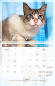
So first we had a meeting to decide on the format; Will it be folded? Will it be individual pages with a spiral? What is the finished size after cutting? etc… I say this because obviously, you need to know what space you will have to work with, how large your picture will be, in what format (vertical or horizontal), will there be text (in this case there had to be to tell the story of each month’s cat, are the date small or in larger squares to allow for notes? etc…
I personally wanted to go for something more fresh & different but the team decided we’d go with a standard 11 x 8.75 inch, folded calendar with large date boxes to allow people to add their personal notes in.
So now I knew we’d need very large high quality images that could be printed in 10″ x 8″ and that also implied a horizontal format for the images. Then we wrote out our call for people to send us pictures of their PuRR Project adopted cats.
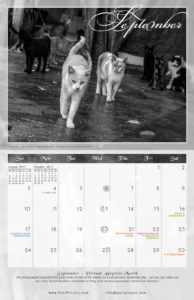
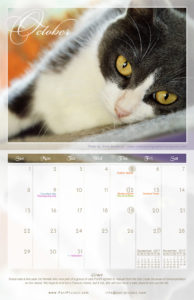
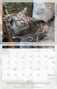
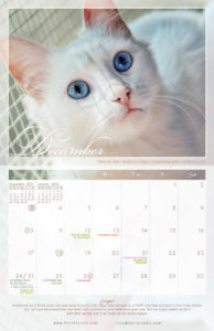
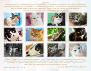
The selection process wasn’t easy. Some of the images we received would have been outstanding had it not been for their low resolution (which meant I could NOT blow them into a 10 x 8″) and others were high resolution enough but just plain blurry or grainy… This is, of course understandable, as the common folk doesn’t necessarily know what resolution is needed for print or just aren’t really good photographers plus adding to that the fact that animals, especially cats, can be very difficult to take pictures of in the first place… then you have composition, lighting etc… In the end, this is where I spent most of my time; countless hours of photoshopping images to remove hairy arms from the image, adjusting lighting & color tones and in some cases, completely redefining the background the cat was in. One particular case, December of 2013, took me over 36 hrs alone because it’s a full creation from top to bottom. See, we were short one pic so I went to the house of a PuRR cat in foster care, shot pictures the cat on a terrace and then transposed the one I selected over my made up Christmas background. Some will say it’s cheating but really it isn’t so much when you consider the point of this calendar. First it is a PuRR cat, and in the end, the point was to sell calendars to make money for the shelter & cats still residing in it… so all is forgiven in this case. I will say though, that for all the pics sent by people who had adopted a PuRR cat, I was extremely diligent in altering the pics as little as I could to keep them as true to the original as was possible but still end up with an image that would be very pleasing to everyone.
Deciding on the theme
The theme is a general concept that includes the style, colors, fonts etc…
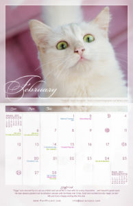
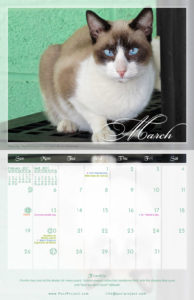
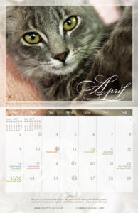
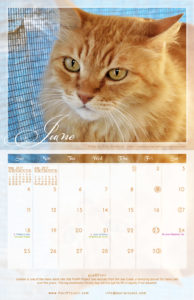
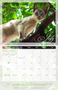
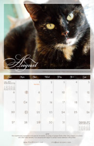
I decided to use a glazed glass theme for this calendar design. In order to achieve this, most of this calendar uses transparency & multiple layers on many different levels. The colors are varied yet soft as is the typography I used. I went for classy rather than bold.
Sorting the images for each month
That wasn’t too bad. Some months, such as February (Valentines), March (Easter), December (Christmas) are fairly easy in the sense that you’ll try to pick an image that gives a sense of what you’d like to portray, then make use of color to bring the rest home.
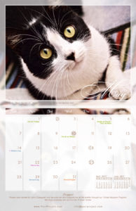
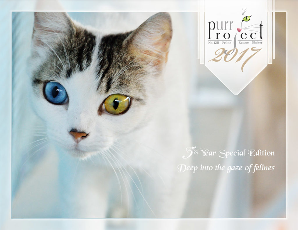
I chose this image for the cover because it was a large, clear image with the right composition and color tones. Since this image was of fairly good quality all that was needed was adjustments of levels and a slight increase in saturation as I had to lighten the image a bit and color fades during that process. It was just a perfect cover from the moment I received it in my inbox… so that choice was easy.
Then we went by elimination to fill in the other months.
Customizing the dates & Holidays
Here I suppose I could have made my life easier by using pre-made templates but I wanted something unique and went, instead, with a full custom grid I had to create from scratch.
Again, this seems easier than it actually is; well not that it’s hard but it’s very time consuming. Each month needs to be correct (easy to make stupid mistakes here), the spacing needs to be even, your numbers, though small and stylized need to be easily readable, the holidays (in this case Canadian, American & Mexican) also need to be exact, the moon phases as well… it’s just a lot of detail one can easily get wrong… it does get confusing.
Because ours was a full 11″ x 17″ folded into a 11″ x 8.5″ calendar, you also have to take into consideration the thickness of the paper you’ll print it on because as you get to the most outer pages, the fold gets relatively thicker and you need to accommodate for that extra thickness in the design as well.
Once all your individual full 11″ x 17″ pages are designed, you need to re-assemble them in back-to-back reversed sets so that once printed and assembled, you have the right months to go with the correct images & have them face the right way. This is easy for designers but can easily get very confusing for a non-designer attempting this for the first time.
All in all, this was a very fun project that we have been repeating every year since. But now that I’ve done a few, I’m getting the hang of it.
As stated in PuRR Project’s newsletter of April 2013, after our first edition was done & sold out months before:
Last year’s calendar was our first and it was a great success and raised a lot of pesos as a result. It was beautiful and will be hard to top… but we’re gonna’ try!
Indeed we have and we hope to continue to outdo ourselves every year!
- Posted In:
- Articles
- Graphic Artwork


